Redesigning the Kroger app experience for over 11M users

Timeline
3 Months
My Role
Senior Product Designer
Platform
iOS & Android App

CHALLENGE #1
Non-Intuitive Navigation
The app’s navigation and overall structure can feel visually cluttered, making it difficult for users to quickly find what they need.
Example
Browsing categories, discovering deals, and accessing savings requires multiple taps and screens, leaving users unsure of where to go next.
Impact
Confusing navigation slows down the shopping experience, frustrates users, and can lead to lower engagement and missed opportunities for savings or product discovery.


CHALLENGE #2
Inconsistent Experience
The app’s visual language lacked consistency, with varying colors, typography, and layouts across screens, leaving the overall experience feeling cluttered and disjointed.
Example
Buttons, cards, and information panels differ in style and spacing from screen to screen, making it harder for users to navigate and understand the interface.
Impact
Without a cohesive design system, the app feels fragmented, slows down development, and makes it harder to scale or introduce new features efficiently.

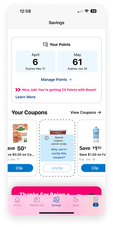
CHALLENGE #3
Hidden Savings
The existing savings page and tools are buried or hard to navigate, making it easy for users to miss out on deals and rewards.
Example
Offers, digital coupons, and rewards are scattered across multiple screens, requiring users to dig through menus to find relevant savings.
Impact
When savings aren’t easy to find or use, customers may miss opportunities to save money, reducing engagement and diminishing the perceived value of the app.

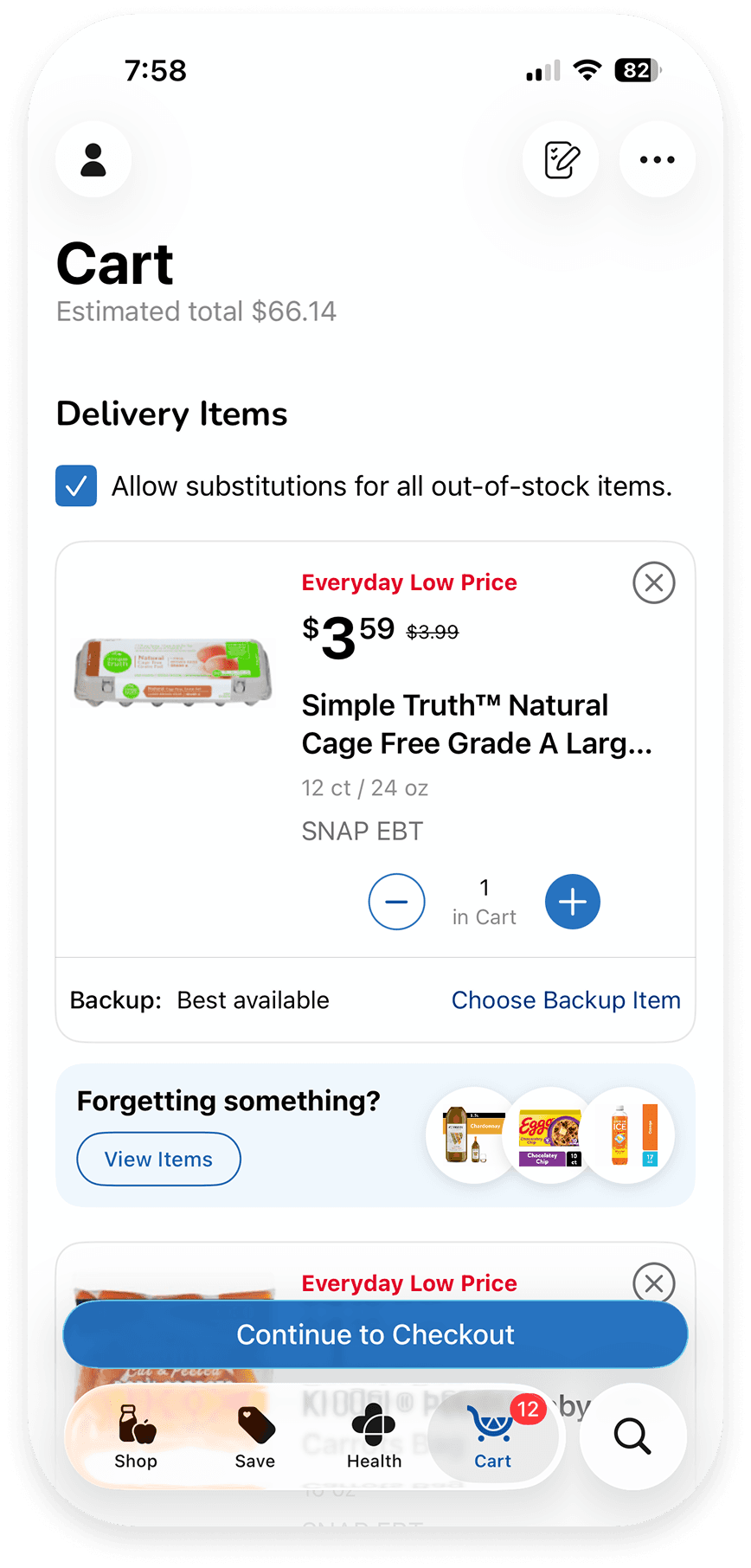
CHALLENGE #4
Inefficient Search
Finding specific products can be cumbersome due to limited search and filtering options.
Example
Users often scroll through multiple screens to find items.
Impact
Slow or frustrating search can lead to missed purchases, lower sales, and reduced engagement with deals and promotions.
Visual Exploration
Early on, we were asked to define what the new Kroger app should feel like.
I built a series of moodboards that pulled from competitor patterns, color exploration, typography, and imagery direction but also layering in our current app experience. Seeing it side-by-side made the gaps impossible to ignore.
That contrast sparked the conversations that shaped our visual direction and ultimately became the foundation for where the redesign headed.


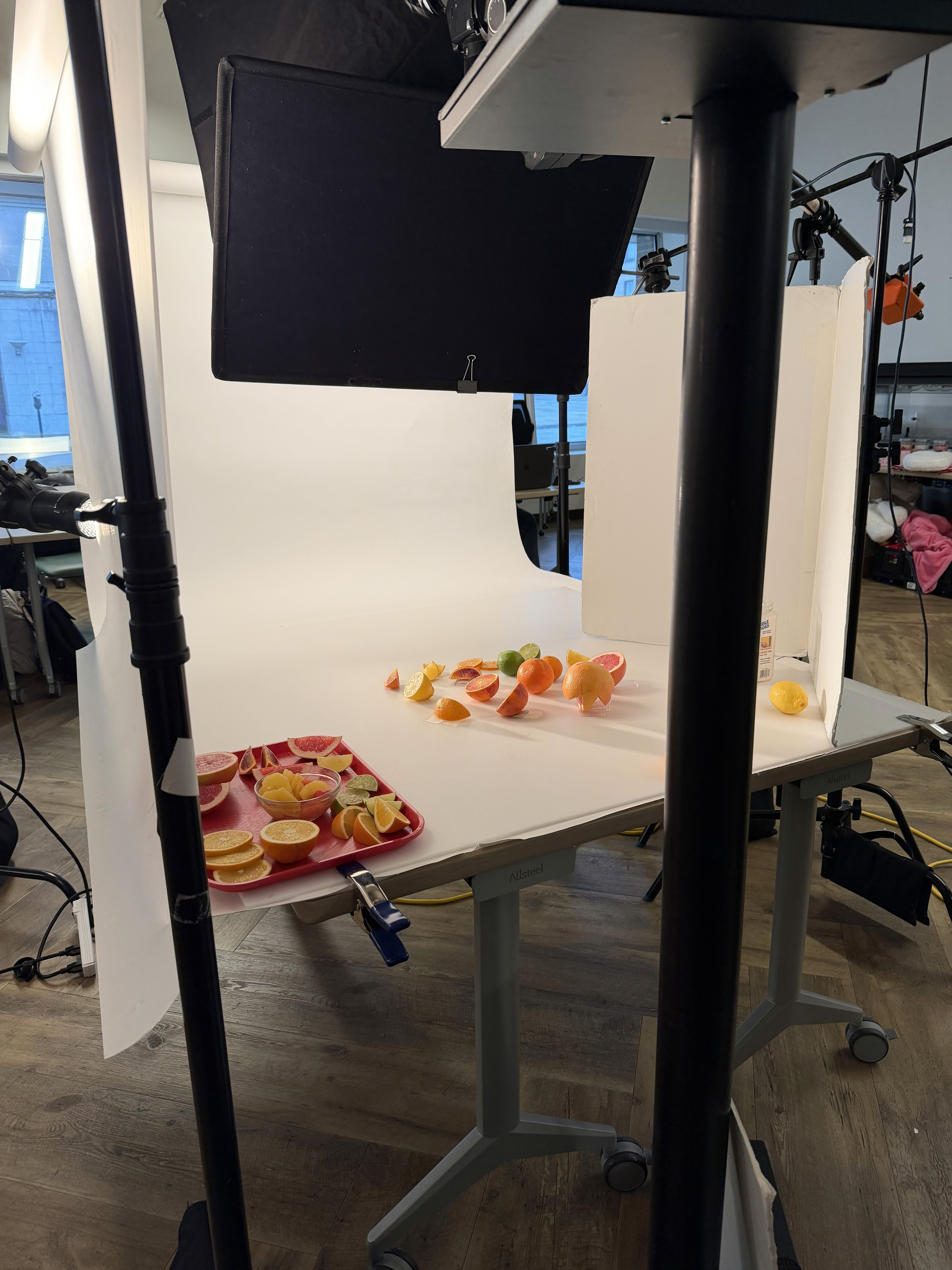
Photography Direction
Photography is how users connect with food and products - it’s often the biggest factor, outside of price, in influencing purchase decisions. For the Kroger app redesign, I took the lead in defining the overall photography vision, crafting a presentation to align key stakeholders and collaborating with our Creative Services to guide new imagery. This was a major undertaking and, as a photographer myself, it’s where I’m truly in my element - diving deep into lighting, composition, and storytelling to create a cohesive, “food-first” experience that elevates every interaction in the app.


Early Navigation Exploration
Early on, I explored a range of navigation wireframes to rethink how the experience could feel more intuitive. These concepts were intentionally rough, focused on structure over polish, and helped us experiment with new approaches to hierarchy and flow. I wanted to lean on our unique branding and help elevate our branding. While the final direction evolved (due to Apple's liquid glass), those early wires captured how we were challenging the status quo and thinking differently about navigation.


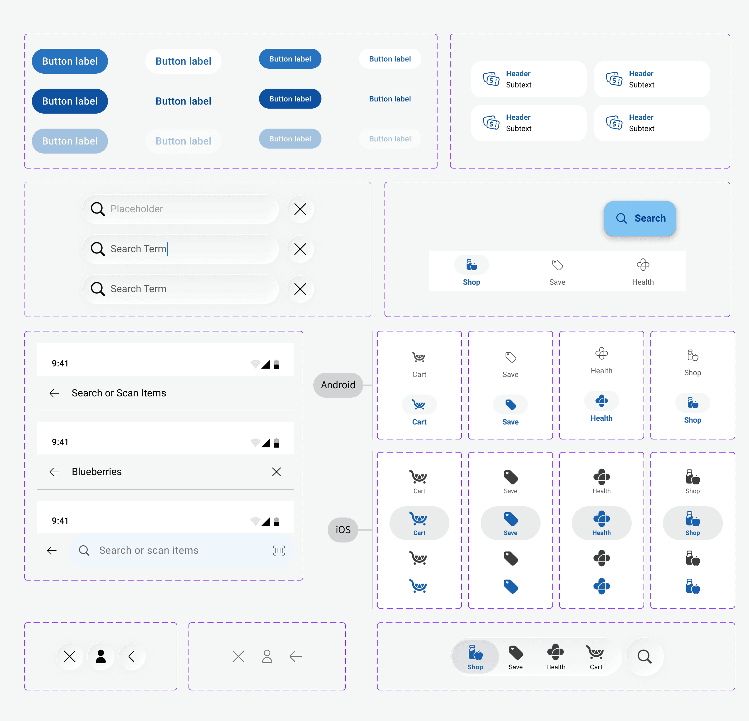
Using Existing Libraries
Liquid Glass
Material 3
Citrus (Kroger Design System)
We wanted to push the overall app design forward, but we also had to stay grounded in platform standards. That meant designing with Liquid Glass and Apple’s system in mind, building for Material 3 on Android, and still honoring our own internal design system "Citrus".
Each platform was designed intentionally for its native patterns, but we layered in our brand system to keep the experience cohesive and unmistakably Kroger, just with a "refresh" look.
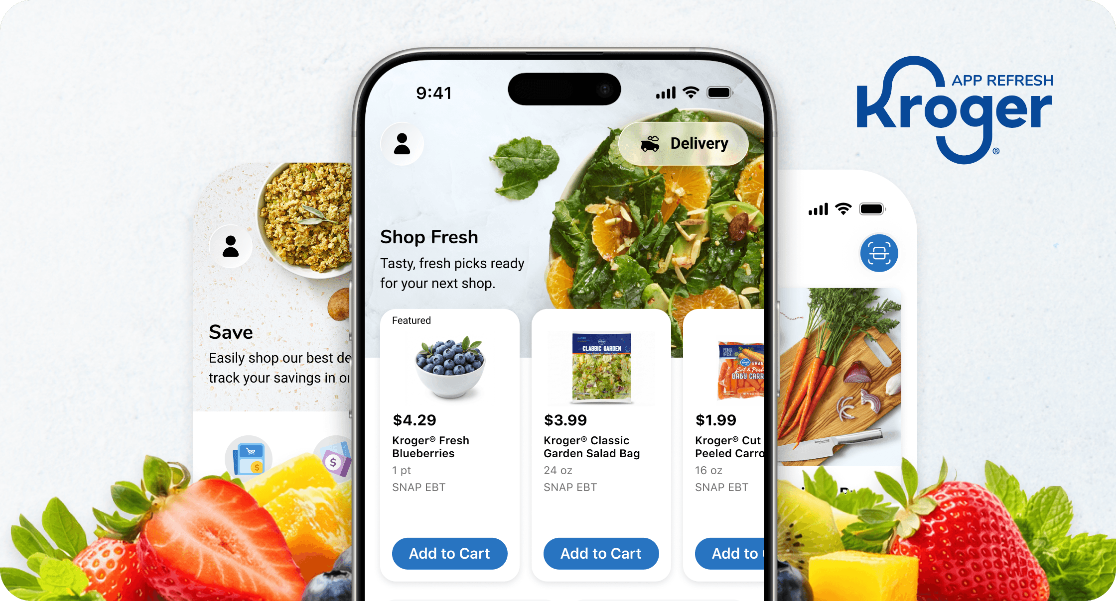
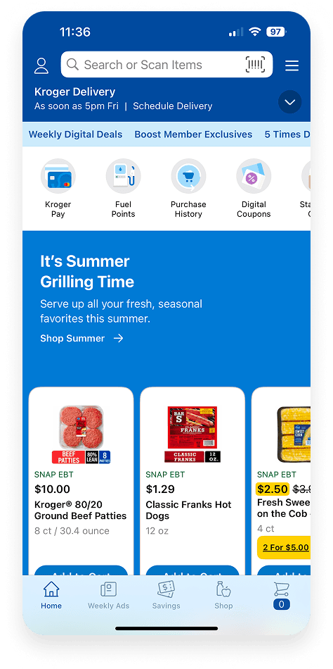
Before ReDesign

ReFreshed Design


Stay Tuned….
More to come with the ReDesign that I can't wait to share and for our customers to enjoy!


