Designing the next era of XavierUniversity.edu
Timeline
10 Months
My Role
Web Designer
Platform
Web / Mobile Web

CHALLENGE #1
The First Impression Missed the Mark
The homepage made navigation difficult, with unclear wayfinding and competing priorities that left visitors unsure where to go next.
Example
The homepage tried to serve too many goals at once. Navigation felt confusing, with important information scattered across multiple areas and no clear entry point to guide prospective students. The initial view offered only a search bar, leaving visitors without context or direction on where to begin their journey.
Impact
Without clear wayfinding or prioritized content, users struggled to find what mattered most. The experience felt disjointed and overwhelming, making it harder for prospective students to explore programs or understand what Xavier had to offer at a glance.
CHALLENGE #2
Unclear Visual Hierarchy
Inconsistent fonts, colors, and emphasis left users unsure which content was most important.
Example
Headings, links, and calls to action blended together, forcing users to hunt for critical info like application deadlines or campus news.
Impact
The lack of clarity reduced readability and made key actions harder to discover, weakening the overall user experience.
CHALLENGE #3
Inconsistency Across Pages and Departments
With content managed by dozens of contributors, the site lacked structure and visual consistency. Each department styled and formatted pages differently, leading to an uneven and sometimes confusing experience.
Example
Page layouts, typography, and color usage varied widely from one section to another, making it difficult for users to understand whether they were still within the same site.
Impact
The inconsistent design weakened brand trust and made navigation feel unpredictable—turning what should have been a unified experience into a patchwork of disconnected pages.
Final Design
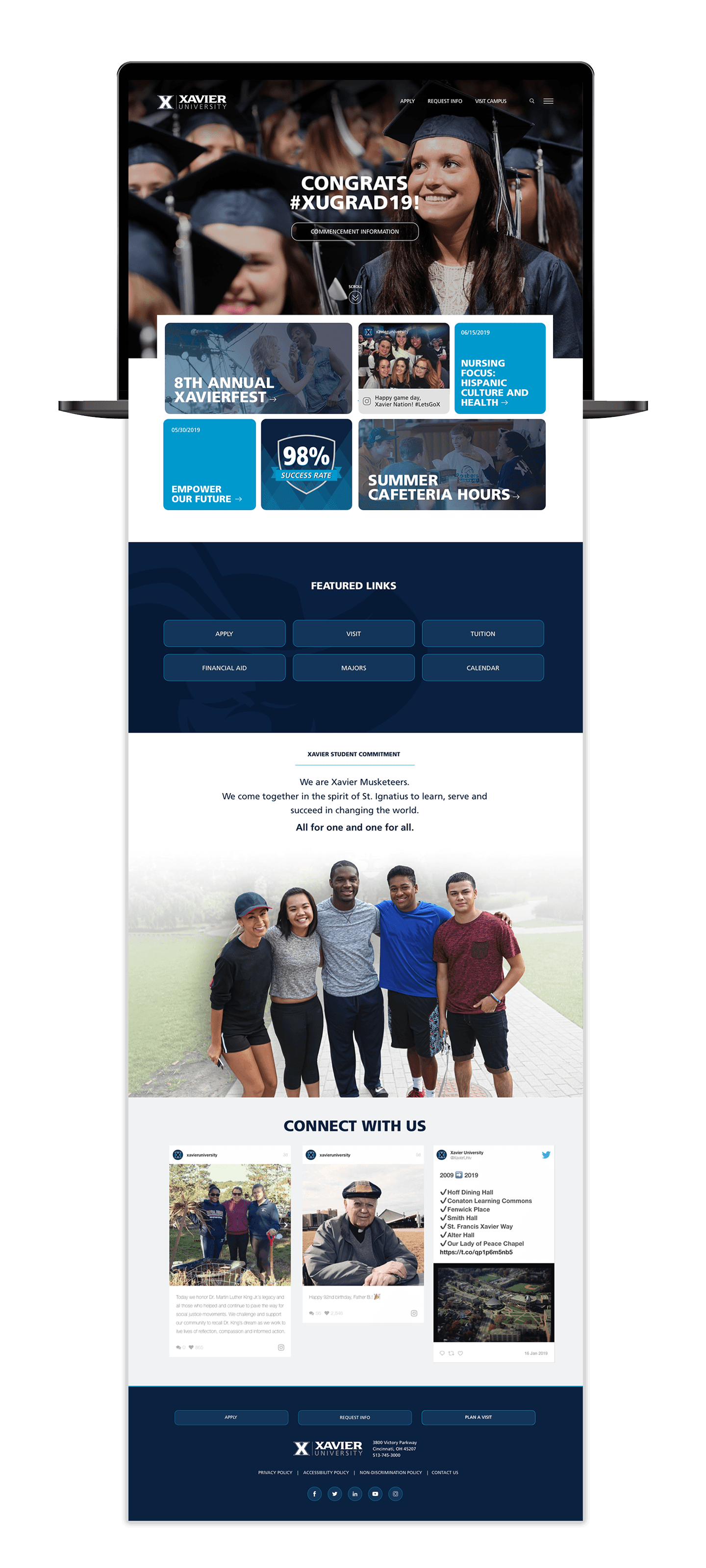
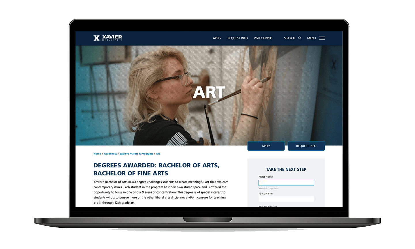
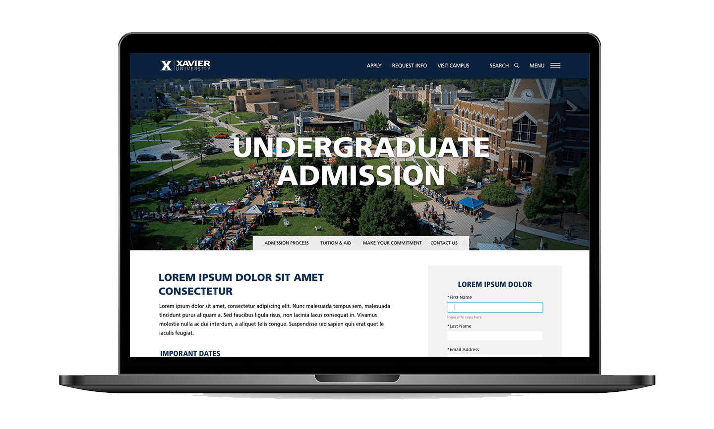
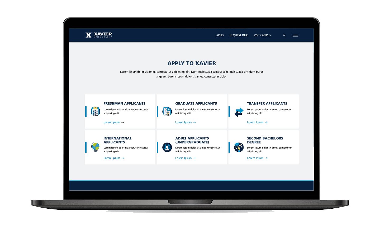
A modern, accessible experience for every visitor
As part of the Marketing and Communications team, I worked closely with departments across campus including Admissions, Academic Affairs, and Student Life to ensure the redesign addressed the needs of each audience. I spoke directly with high school students, current students, and faculty to understand their perspectives and priorities. I also collaborated with our in-house print and photography teams to align visuals, messaging, and tone, creating a cohesive brand experience across digital and print touchpoints.
The new design captures the energy and character of the Xavier community. It guides visitors with clarity and purpose, creating a digital experience that’s easier to use and more reflective of the university’s mission and spirit.


